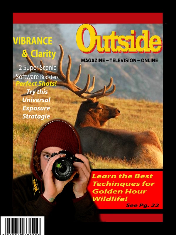
 While planning out my magazine cover ideas, I decided to choose Outdoor Magazine because I enjoy the outdoors and shooting photography in a natural element. This magazine company was my main focus because of the types of activities and special articles that they decide to publish. Anything from photography Tips & Tricks, to outdoor events and gatherings. To have this magazine actually notice my work would be a dream because their content is very similar to what my interests are.
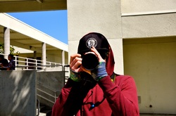
To create the text on the cover, I used a very basic font that is bold. The bold font tends to pop and catch the viewers eye. For the major subtitles I also used a golden-yellow color to compliment the main photo and color scheme. The gold font looks very appealing when it is contrasting with the red border. I also tried to match the main colors of the text to the main colors of the actual Outdoor Magazine Logo. For the design of the cover, I used one of my personal photographs to catch the viewers attention. The golden hour photograph real goes well with the font and border colors portrayed on actual issues of the magazine. I added a photograph of myself to the bottom corner because the idea of this project was to have a point of interest depending on a person. A strobe light is a large light used in studio settings. The purpose for this light is to give the photographer a larger flash, without a delay, that produces the correct lighting for the subject when taking a photograph. The setting that was used for my portrait on the cover was a bright room with a grey backdrop. The strobe was set up along with a person holding a golden reflector to create a nice warm tone for the subject (me). Along with the strobe, a soft box was also used to aid the lighting of the subject. A soft box is a small box that fits around the bulb in the strobe light. It is used to reflect the light when the strobe is triggered. You can use a soft box to achieve many different types of lighting to make the subject look the best. The gold reflector that I mentioned earlier is a round disk with gold foil. The reflector is used to reflect the existing studio lighting onto the subject but the gold color gives it a warm tone. We used the reflector to balance out the bright white tone of the flash, with a warm tone of the reflected light. Once the reflector and studio lighting was directed onto the subject we used a grey card to check the white balance of the setting. A grey card has three different shades of grey on it and you compare the surrounding light to the specific color you want on the grey card. It is just another way to make sure the studio lighting is perfect.
0 Comments
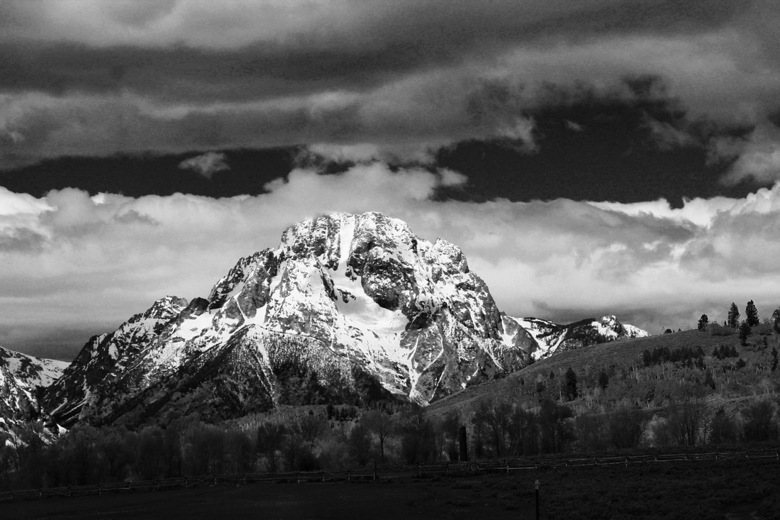 In The Clouds, Grand Teton View
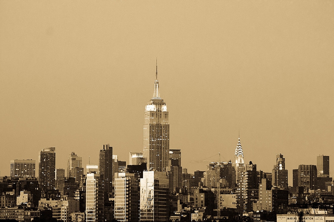
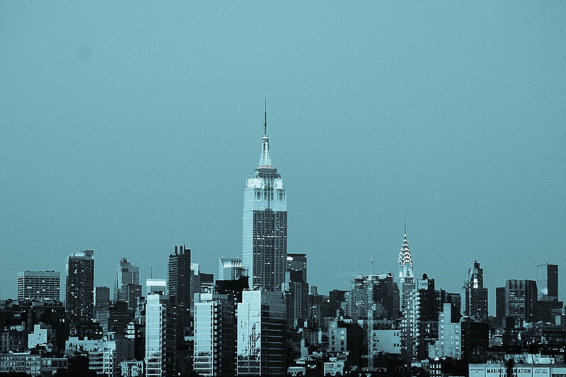
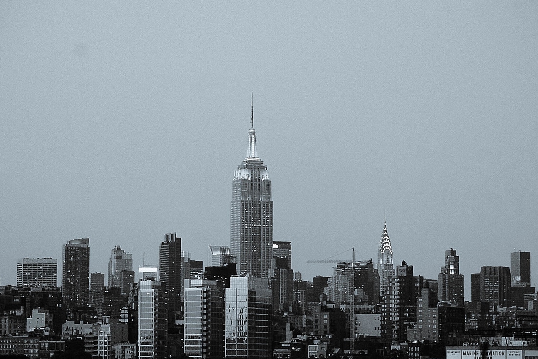
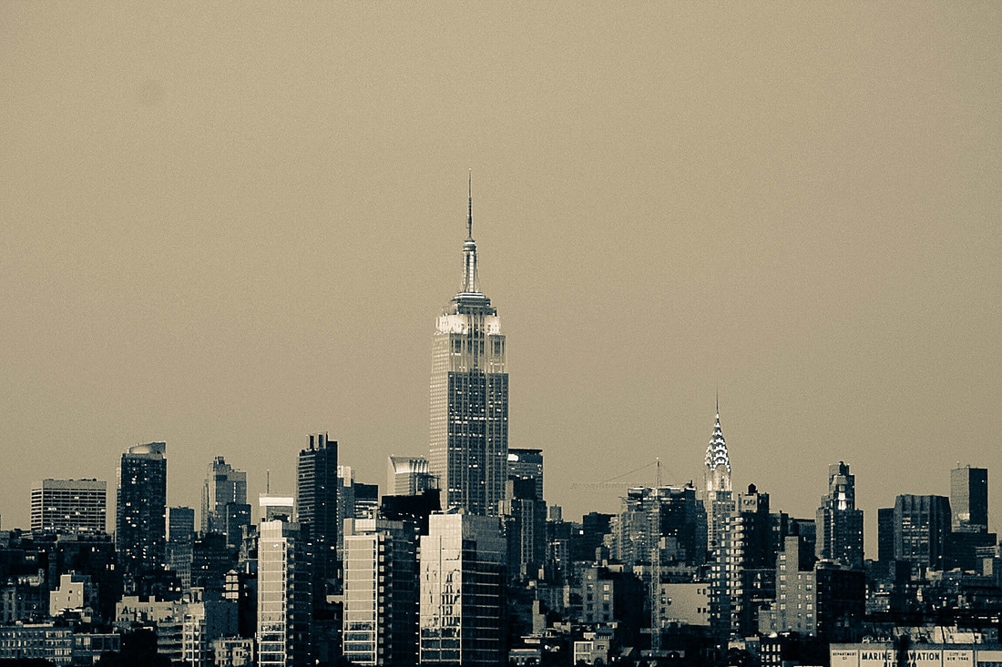
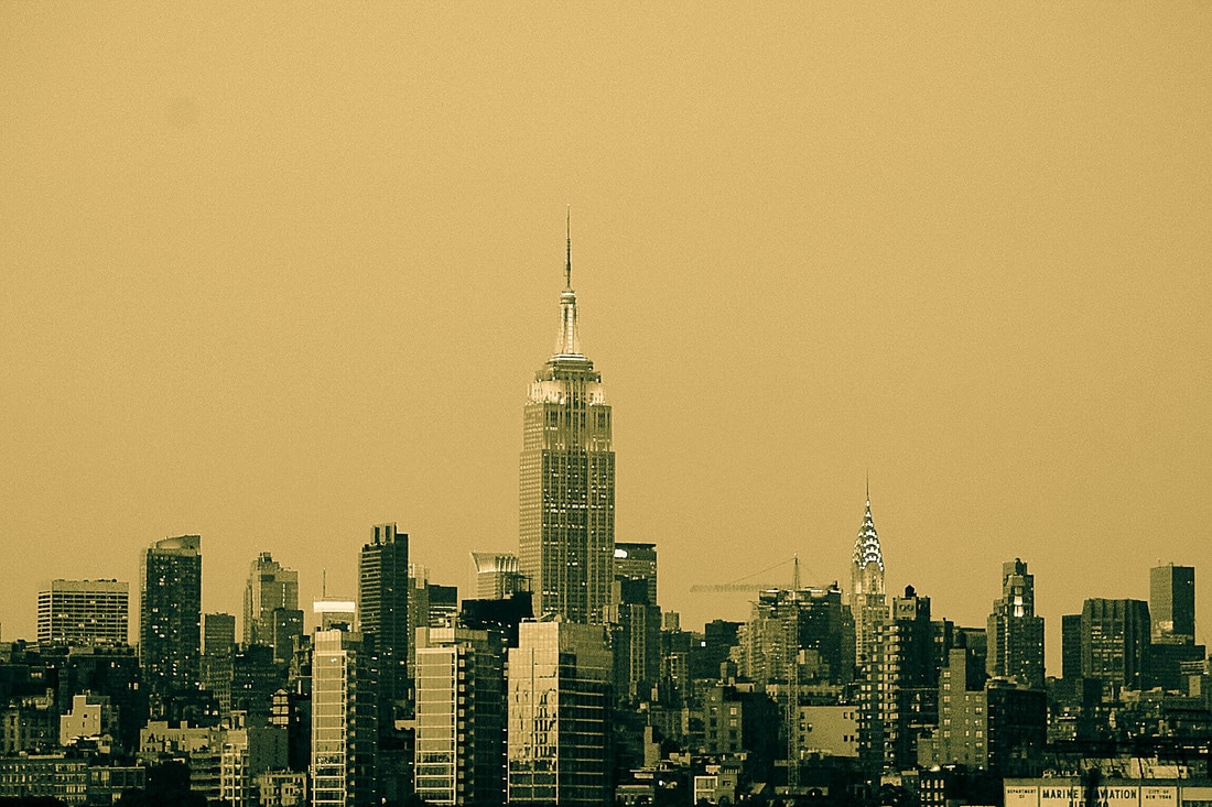
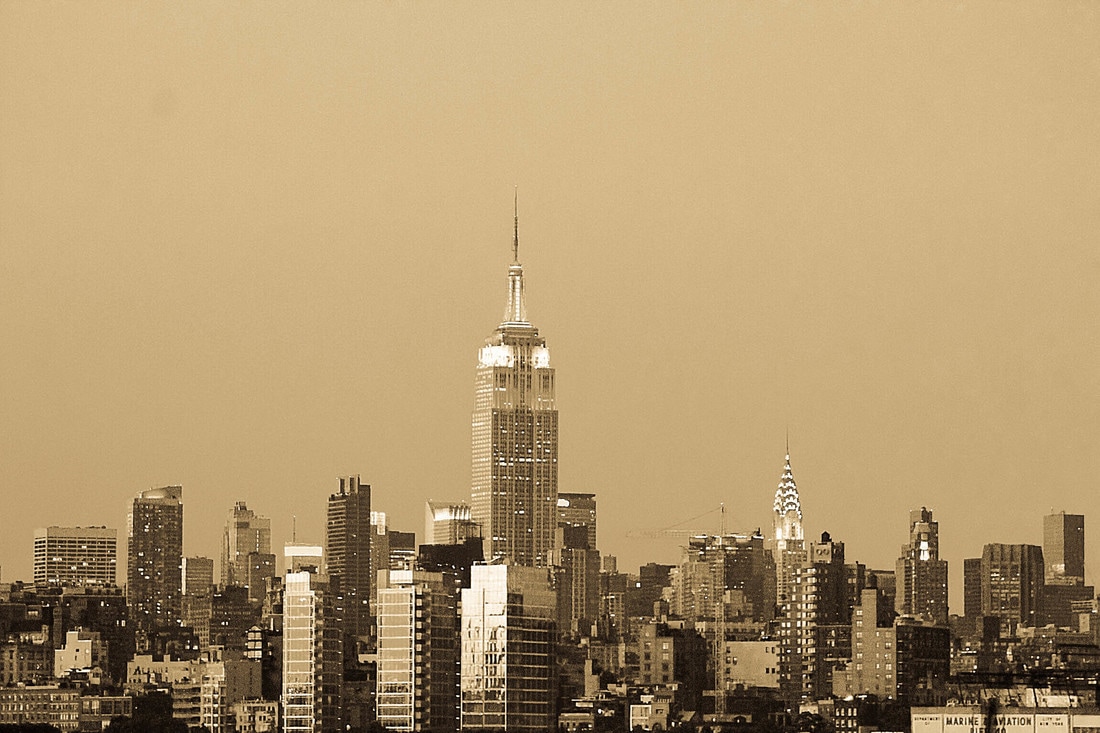
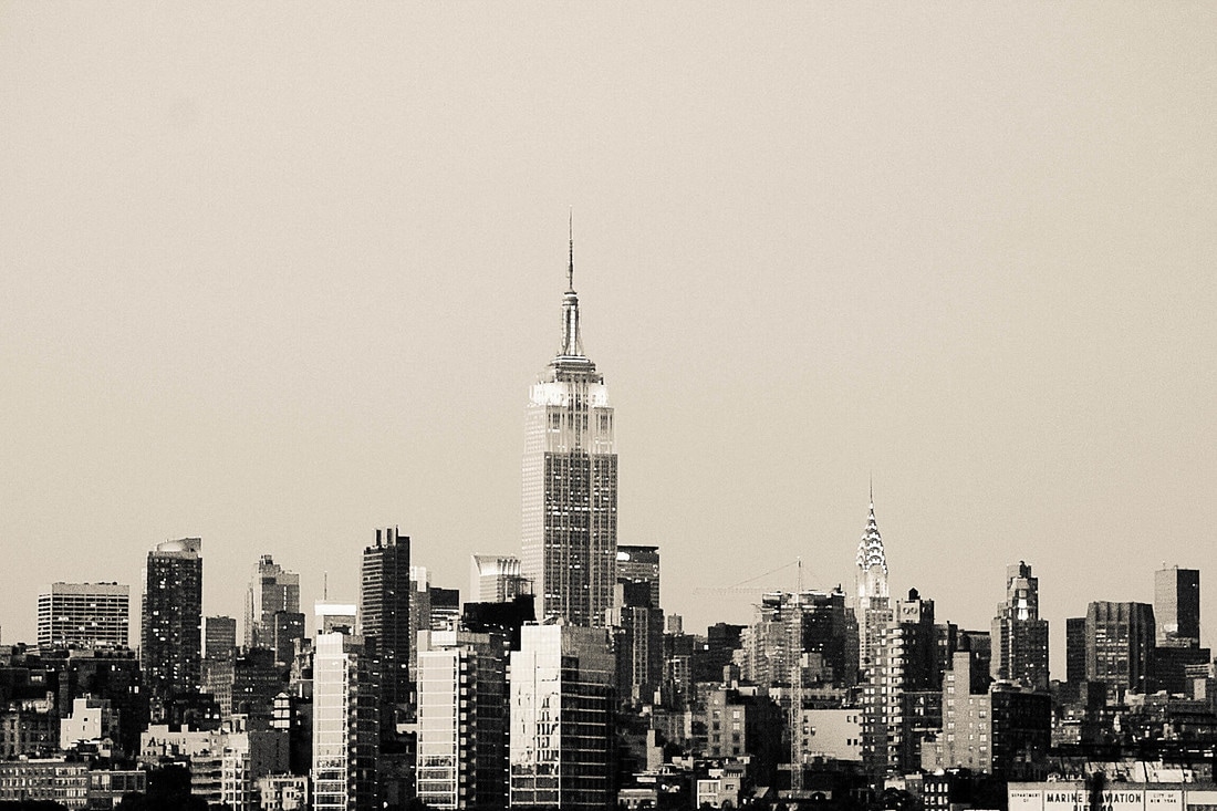
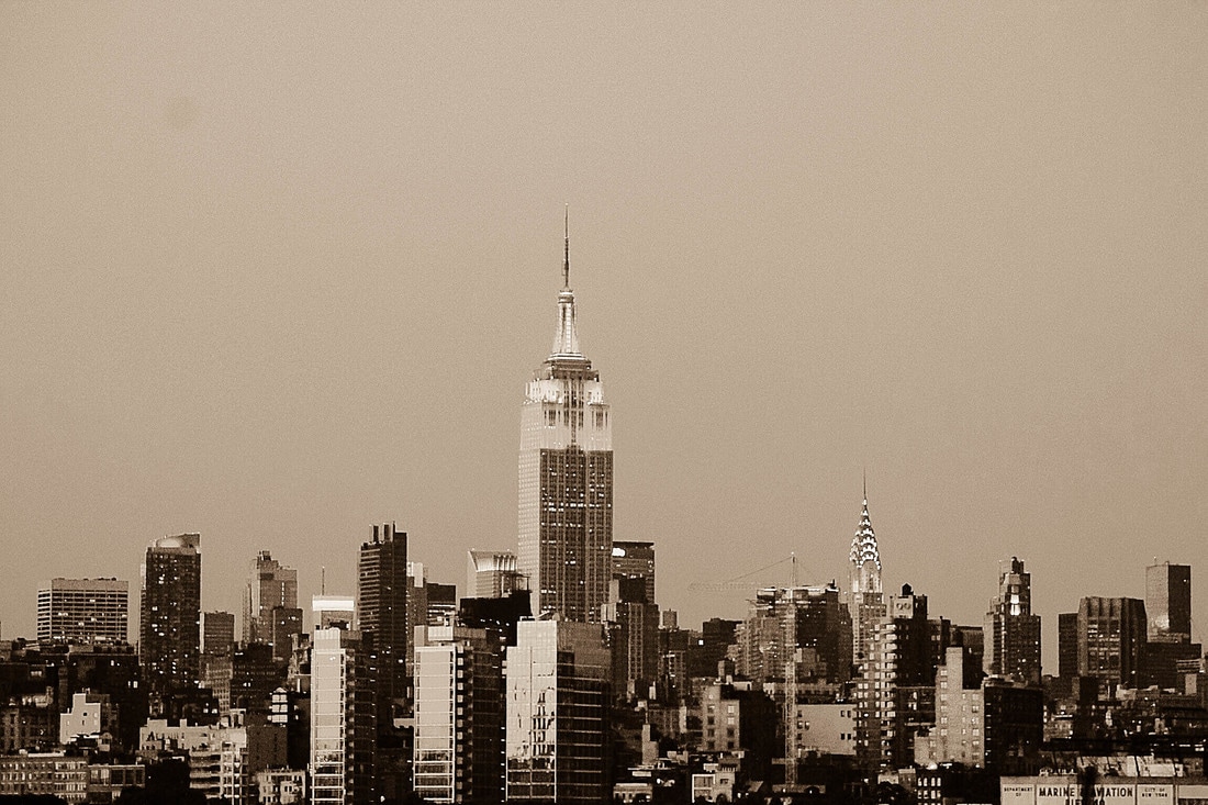
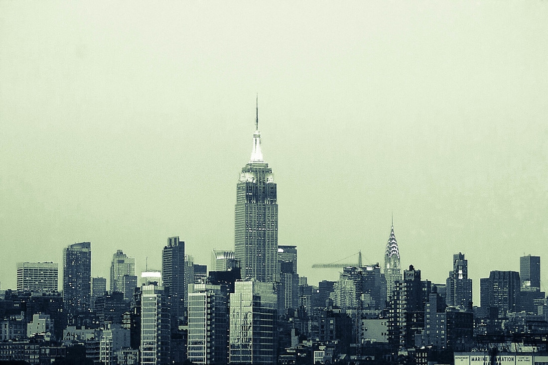
This photo was taken during one of my favorite road trips through Grand Teton National Park. A few elements of art such as value, texture, and form are complimented very nicely in this shot thanks to the monochromatic adjustment. To capture this image I used a Canon EOS Rebel T3 Digital SLR Camera with a detachable EF-S 55-250mm f/4-5.6 IS II lens. To apply the monochromatic adjustment to my photograph I simply downloaded the photo onto my MacBook Pro laptop, and then used iPhoto to filter the image and deplete the color. Monochrome is the division that I entered this piece under because without color, this image shows amazing texture and value between the snowy mountainsides and soft clouds. An Epson P800 printer with Epson Glossy Photo Paper was used to create this print. Original B&W Toned Presets
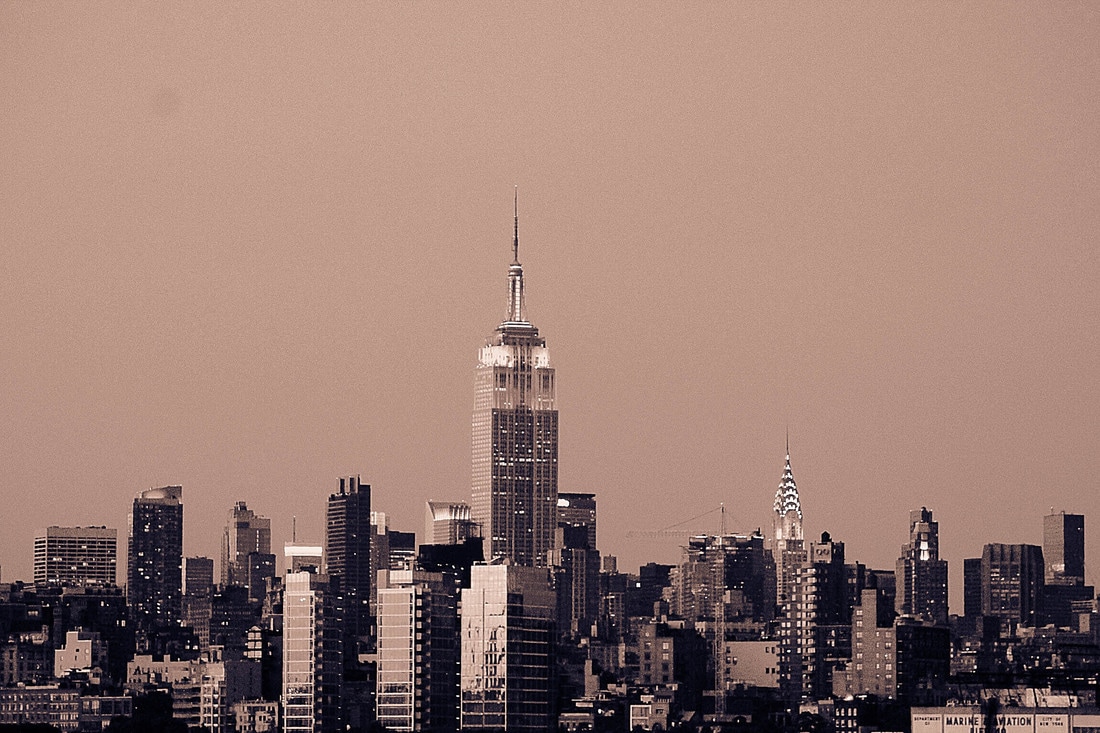
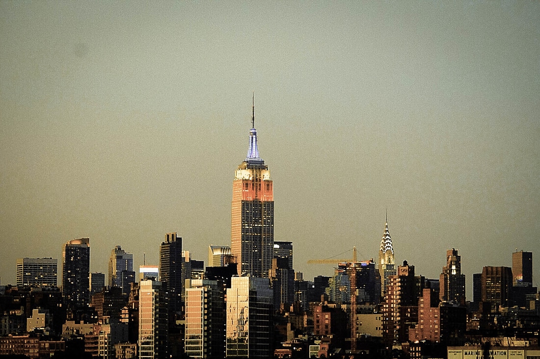
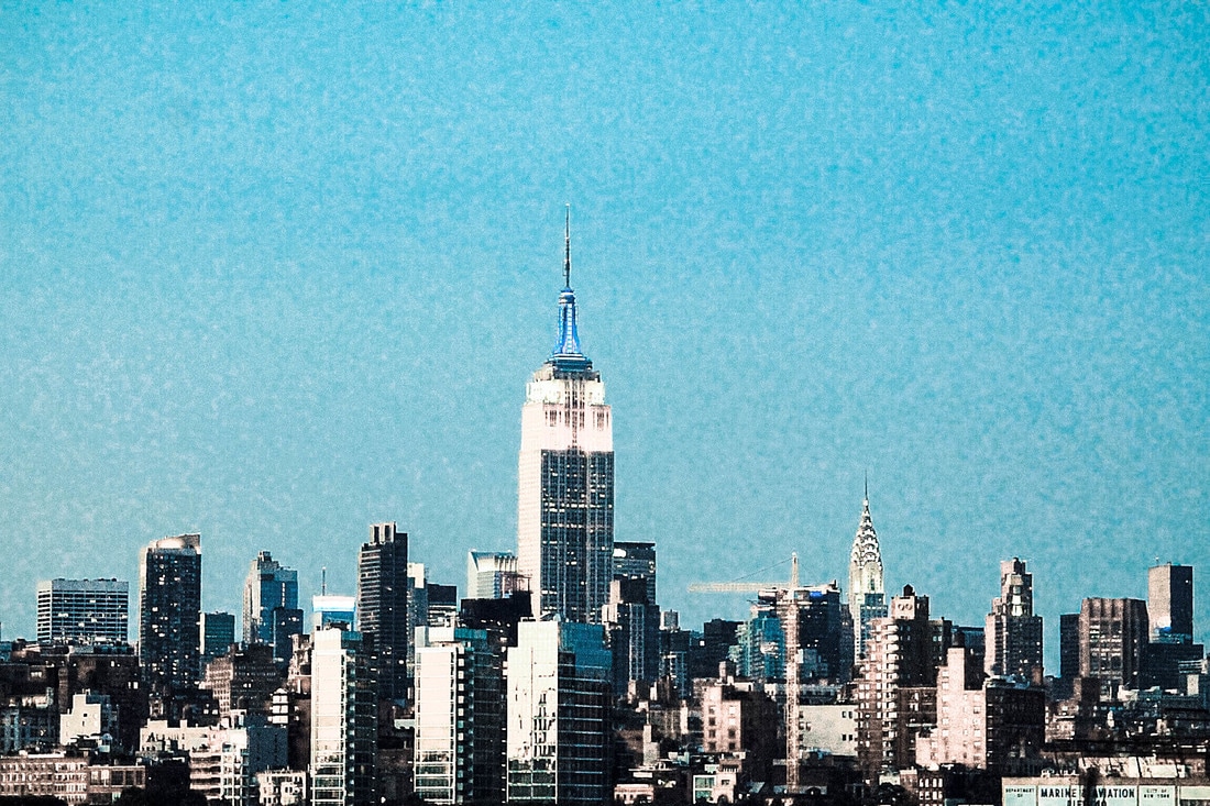
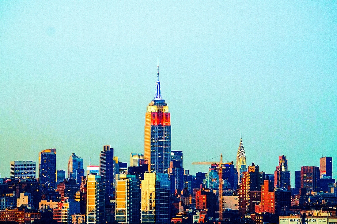
Color Toned Presets
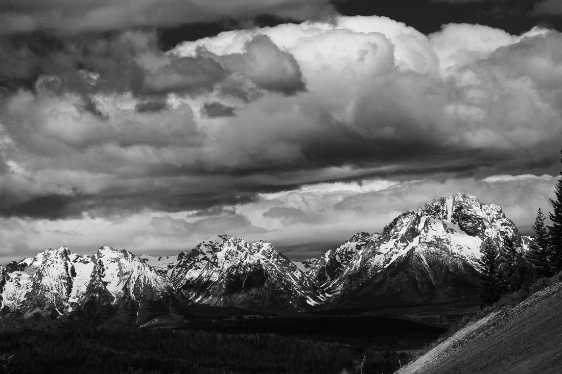 In The Clouds, Grand Teton View
This photo was taken during one of my favorite road trips through Grand Teton National Park. A few elements of art such as value, texture, and form are complimented very nicely in this shot thanks to the monochromatic adjustment. To capture this image I used a Canon EOS Rebel T3 Digital SLR Camera with a detachable EF-S 55-250mm f/4-5.6 IS II lens. To apply the monochromatic adjustment to my photograph I simply downloaded the photo onto my MacBook Pro laptop, and then used iPhoto to filter the image and deplete the color. Monochrome is the division that I entered this piece under because without color, this image shows amazing texture and value between the snowy mountainsides and soft clouds. An Epson P800 printer with Epson Glossy Photo Paper was used to create this print. |
Archives
June 2017
Categories |

 RSS Feed
